ruminations about architecture and design

Saturday, June 30, 2012

urban gestures


This is a picture of the dry moat that surrounds part of the James Farley Post Office in Manhattan. As an urban gesture I find it acutely medieval and awful. I also am starting to form an opinion of the building (which I didn't know existed until a few days ago) which is acutely negative and unsympathetic. I regard it as an anachronism in the city of New York--a throwback to an earlier era, bereft of function, and a burden on the citizens of that illustrious metropolis.

But, it's a Historic Landmark, protected by the full force and blind might of the preservation movement. It's built on 8 acres of train tracks, so a vertical intervention would be astonishly expensive.

More on this subject later.

Friday, June 29, 2012

building form


Interesting article by John Straube at Building Science Corporation. http://www.buildingscience.com/documents/insights/bsi-061-function-form-building-shape-and-energy/

Straube points out that building form for large buildings is less important for energy use than it is for small buildings. In many respects, this is a corollary to the mass/scale/surface area rule in biology. I don't construe Straube's position as giving carte blanche to Architects to get away with crazy geometry and being able to claim that it's inherently green.

Straube also asserts that floor area to surface area of enclosure is a more meaningful way to assess building energy than building volume to surface area of enclosure. I agree with him on this issue, but I'm cautious about advocating minimized ceiling heights as a good idea for buildings. In my experience and observation, ceiling height is a much more important determinant of architectural quality than plan shape or size. I've also seen many examples in residential architecture where low ceilings have been the deciding factor in the renovate vs. demolish debate. Higher ceilings in commercial buildings can mean better daylight penetration to interior spaces.

Thursday, June 28, 2012

the last floor plan

In some earlier discussions on the subject of terminal design, I didn't have the courage to point out that residential architecture seems to have reached a plateau in terms of quality and function. Adjacency of rooms, types of rooms, and proportions of spaces have been well established since the post-war construction boom. My opinion is heavily biased towards North America, but since we seemed to have exported architectural aspirations to everywhere else it's reasonable to expect suburban sprawl in China, Africa, and India. I wouldn't be surprised if it's already in place.

Houses have bedrooms, kitchens, bathrooms, and living rooms. They have storage spaces, both in the form of closets as well as dedicated volumes like basements and attics. Protection from the elements is the primary mission of residential design, but the standards of construction have improved to such a level that most people are unaware of the great progress that has been made in enclosure technology (okay, I'm getting a bit hyperbolic there).

Wednesday, June 27, 2012

important announcement

Towers of Ilium will become a cat blog. Since architecture really isn't very useful or interesting, I've decided that I need to reach a broader audience with content that is meaningful, astonishing and uplifting. In other words, all things cat, all the time.

How does Facebook have a business model?

Monday, June 25, 2012

no photo monday

The Architectural Billings Index declined in May, which is bad news in general for the economy as a whole. Our business has been doing marginally better because of an uptick in residential remodeling projects--a trend that is consistent with a recovery of the housing market.

In my last post I should have been more explicit about how I think that the distinction between "public" and "private" is stupid and misleading. "Private" generally means profit-oriented, but a "Public" government is concerned with profits as well, whether they are measured in productivity gains as a the result of a relatively stable social structure or increasing life expectancy. The method of measurement cannot always be turned into dollars or some other type of numerical entity (now that there is a contradiction, ain't it?). Concepts like "better" and "worse" are inherently qualitative. A successful private company offers an easier measurement system.

But, I'm getting sidetracked and I return to my original point. There is no substantial difference between private and public. The actions of one affect many, and the actions of many effect one.

Saturday, June 23, 2012

bury my heart in sandy springs georgia


I just read an article about Sandy Springs, Georgia, a suburb of 94,000 people located near Atlanta. The story describes how the community has outsourced the majority of city services, like building inspection, courts, public works and 911 calls, to private companies. According to sources interviewed, things are working out well.

The story was framed in the context of national debates about public vs. private management and governance. I believe this debate is flawed, and there are significant clues in the story about why the character of an organization has less to do with the teachings of Marx or Hayek and more about the competence and will of the people who are responsible for its management.  Human organizations, whether they number two people or two billion can separated into two categories--those that work and those that do not.

Peter Drucker made this observation, but his teachings seem to have been forgotten by the talking heads who populate the airwaves and bookshelves these days. Sandy Springs has many advantages, not least of which is a core of leadership that is focused on providing services for the people in the community. The same cannot be said for many private corporations, or the kleptocratic regimes that dominate so many nations.

Friday, June 22, 2012

architecture and productivity (#9)


There is a company in China that is building a modular high rise in 90 days. I would be impressed, but such spectacular and misleading examples of productivity have been around since the 1920's. My long running argument is that productivity in architecture and construction has flatlined, and with increasing planning and building complexity, has even begun to decline in certain areas.

This post-war house in Levittown could be efficiently built in a few weeks or a few months. Some production builders in the America south are capable of erecting homes twice this size with 3 bathrooms in under two weeks. To my eye, that's a lateral improvement.

Compared to the cathedrals, modern design and construction moves at a fast pace. But, every project is different. The planning and permitting process for a high rise in Boston can sometime take more than a decade. The building in China I referred to above looks like it is being built in a wilderness, on a flat, uncrowded site.

Wednesday, June 20, 2012

lost vistas

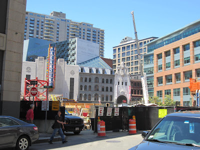
This view will disappear in a few months as construction on the building in the foreground proceeds. This is the Boston Theatre District, and the recent renovations to the Opera House, The Paramount, and the Modern Theatre have helped recreate a section of the city that fell on hard times about sixty years ago. This photograph flattens out an experience that I think is architecturally wonderful. The irregular street grid makes all of these buildings flow together. It makes me consider the city as a building, instead of a collection of buildings.

Sunday, June 17, 2012

house #50930

This house in France was selected by the AIA as one of the best houses of 2012.

Hooray.

Here is all of modern architecture in one description: The sheet of glass framed by steel and concrete.
For the residential experience, it will always seem novel, so long as the anointed design star of the moment injects some trim detail, preferably natural, preferably "green," and always labor intensive, unless it's prefabricated and deliberately cheap and shoddy.

I secretly want to do this someday.

the retail experience endgame

I'm too lazy to research this (as always) but I recall in a previous blog I pontificated on the retail experience and retail architecture. I might have implied that it is heading towards some sort of design endgame. I need to modify that observation. We are all fully aware of the trend towards warehouse style stores and the great efficiency they create for suppliers. In conjunction with this, the internet shopping experience is displacing physical retailers, and driving a modest boom in the construction of
huge distribution centers that are invisible to the person sitting at a computer, credit card in hand.

After shopping in a BJ's yesterday, which is laid out in exactly the same way as every other BJ's, I realized that there is no architectural stopping point for the retail design. The retail model can never settle on a final form, because as soon as some company enters that delusional state where they believe they've got the consumer figured out, and their own supply chain is squeezed to the ultimate end of all possible efficiencies, then that is the precise moment that they go out of business. The next company is faced with the unenviable (unless you're the architect) task of recreating a brand and a shopping experience that recreates a customer base. The souk is forever, but the sellers and buyers will always change the color of their clothes and wares.

Monday, June 11, 2012

don davis-space painter

Towers of Ilium incorrectly  gave credit to Syd Mead for a painting done by Don Davis--an artist and futurist who lives and works on the West Coast. In no small measure his illustrations of space scenes have created a visual link between our planet and the universe around us.

He also has an interesting essay on the viability of space colonies. He makes the point that it is easier to create satellite colonies than to terraform existing planets. I tend to agree with that, to the extent that they are both nearly impossible, the former is more viable.

Human habitats in space constitute the most expensive and technologically intensive architecture humans have ever produced. I wouldn't be surprised if the cubic foot cost of the International Space Station exceeds the most expensive Earthbound building by a factor of 100.

Sunday, June 10, 2012

other worlds


The recent collapse of 38 Studios serves as a teaching moment in business, economics, and architecture.
If I were an instructor of the first two subjects I would use the failure of the company to talk about the challenges of starting and maintaining a business, the influence of easily duped politicians, the desperation of depressed communities, and the sunk cost fallacy.

From the point of view of architecture, I think that the challenge of creating the virtual world of video games doesn't get enough discussion in design schools (at least the ones I'm familiar with). The labor involved to create a compelling, unique, and plausible virtual architectural environment is mind boggling. Every scene in a modern video game requires a level of detail and sophistication that makes real-world architecture all the more mundane.

If it isn't being done already, some games could take advantage of 3-D camera mapping to use existing architectural environments as sets for immersive gaming experiences. We're right on the edge of the Matrix.

On a related note, I wasn't that impressed by Inception.

Wednesday, June 6, 2012

r is for rocket

Ray Bradbury died yesterday. I remember reading his books late at night and feeling frightened, but at the same time, entranced by visions of worlds that were at once familiar and fantastical. I hope that he is remembered. Sci-fi has lost a great one.

Sunday, June 3, 2012

rest stop

A rest stop in Georgia from a series of photos on the subject I found on Huffpost. It's very creative and I doubt that we'll see something like this in the U.S. anytime soon. We're quite conservative here. Our heyday for heroic architecture was the Jazz Age, and although some of that stuff feels dated and conventional now, it was really cutting edge stuff. A building over a thousand feet high! Incredible. The architecture of our highway system, which I've commented on before, is stupefying and banal all at once. Our rest stops get torn down and rebuilt periodically.

Friday, June 1, 2012

How much of architecture is about graphic presentation? I ask this question because I'm not very good at it, or to put it more correctly, I don't spend as much time on it as I probably should because I'm too busy doing other things related to architectural service like talking on the phone, or writing emails, or doing technical drafting (and wasting time blogging).

This is something I designed, which might be getting built this summer. The house to the right is existing. The garage on the left will replace the one-car garage that was original to the house. This is progress, yes?